Can you explain the Y-Scale on your graphs?
For example, for spread strategy #3457 (see graph below) the Y -Scale for the 15 year seasonal appears to go from 3 to 9 for the part that is shaded yellow.
But on the table for this strategy, the average exit price is 3.22. The average profit is 2.37.
So why does your Y-Scale go from 3 to 9 for a difference of 6 when the average profit is 2.37?
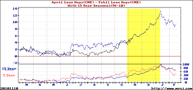
The seasonal pattern (dotted line) is not an average of prices but rather a PATTERN. When we construct these charts, we first plot prices of the current market through time, as is usual. The computer then "grabs" the seasonal pattern and tries to fit it to the PATTERN of trading exhibited so far by the current market. Thus, the seasonal PATTERN suggests this spread should persistently favor April right into mid January --- but it does NOT suggest by how much. A seasonal PATTERN can suggest only timing and direction --- never price. For the latter, one must use the daily, weekly, and monthly charts.